Address
304 North Cardinal St.
Dorchester Center, MA 02124
Work Hours
Monday to Friday: 7AM - 7PM
Weekend: 10AM - 5PM
Address
304 North Cardinal St.
Dorchester Center, MA 02124
Work Hours
Monday to Friday: 7AM - 7PM
Weekend: 10AM - 5PM
A Sunburst chart is a circular data visualization that presents hierarchical information. It organizes data into rings, where the innermost ring represents the main node, and the outer rings represent its children. The size of each arc in the chart corresponds to the value of the data it represents. Moreover, each arc is subdivided into smaller arcs that represent the child nodes.
Sunburst charts are particularly useful when dealing with intricate data sets that follow a hierarchical structure. They allow users to intuitively grasp the connections between various levels of the hierarchy and identify the crucial elements within the data.
Plotly, a Python library, specializes in creating graphs, particularly interactive ones. It can generate a wide range of graphs and charts, including histograms, barplots, boxplots, spreadplots, and more. Primarily utilized in data analysis and financial analysis, Plotly is known for its interactive visualization capabilities. This article focuses on the creation of sunburst charts or visual plots as a means to effectively showcase our data. To educate you, I used a dataset containing Pakistan’s population dataset of 2017. Initially, we import the Pandas library to load the dataset, followed by the Plotly library to visualize the data. In this article, I introduce you to one of Plotly’s plots, the sunburst plot.
Plotly’s Express module offers a simple method called sunburst() for creating sunburst charts. This method takes a DataFrame containing the data, columns indicating the hierarchy, and columns representing the actual distribution values. You can specify a list of hierarchical columns for the path attribute. Additionally, the values attribute allows you to specify the column containing the values used to determine the sizes of the distribution circles.
import pandas as pd
import plotly.express as px

df = pd.read_csv('./data/sub-division_population_of_pakistan.csv')
df.head()
To retrieve the column names of a loaded dataset in a data frame, we can utilize the df.info() function. This function provides us with information about the dataset, including the column names, which we can then use in our code.
df.info()
RangeIndex: 528 entries, 0 to 527
Data columns (total 21 columns):
# Column Non-Null Count Dtype
— —— ————– —–
0 PROVINCE 528 non-null object
1 DIVISION 528 non-null object
2 DISTRICT 528 non-null object
3 SUB DIVISION 528 non-null object
4 AREA (sq.km) 528 non-null float64
5 ALL SEXES (RURAL) 528 non-null int64
6 MALE (RURAL) 528 non-null int64
7 FEMALE (RURAL) 528 non-null int64
8 TRANSGENDER (RURAL) 528 non-null int64
9 SEX RATIO (RURAL) 528 non-null float64
10 AVG HOUSEHOLD SIZE (RURAL) 528 non-null float64
11 POPULATION 1998 (RURAL) 528 non-null int64
12 ANNUAL GROWTH RATE (RURAL) 528 non-null float64
13 ALL SEXES (URBAN) 528 non-null int64
14 MALE (URBAN) 528 non-null int64
15 FEMALE (URBAN) 528 non-null int64
16 TRANSGENDER (URBAN) 528 non-null int64
17 SEX RATIO (URBAN) 528 non-null float64
18 AVG HOUSEHOLD SIZE (URBAN) 528 non-null float64
19 POPULATION 1998 (URBAN) 528 non-null int64
20 ANNUAL GROWTH RATE (URBAN) 528 non-null float64
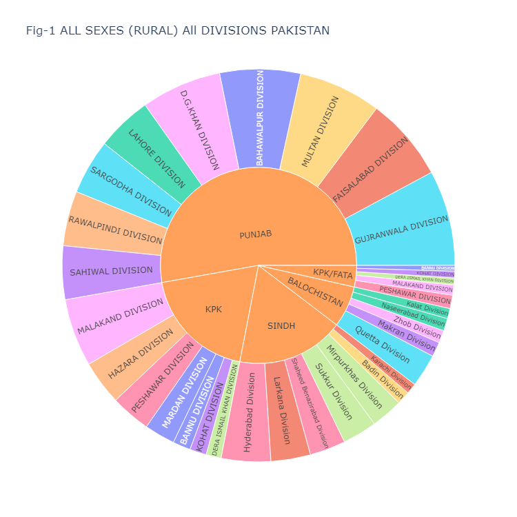
The following code generates a sunburst plot, which is displayed as Fig-1. Feel free to adapt this code for your own data frame. The plot (Fig-1) illustrates the population distribution of all sexes across the provinces and divisions of Pakistan. Here are the details of the arguments used:
df: The data frame containing the dataset.path: The sequence of columns that define the hierarchical path in the sunburst chart. In this case, the hierarchy is defined by the ‘PROVINCE’ and ‘DIVISION’ columns.values: The column that provides the values for the size of the arcs in the sunburst chart. Here, it is the ‘ALL SEXES (RURAL)’ column.color: The column used to assign colors to the different segments in the sunburst chart. In this case, it is the ‘DIVISION’ column.width and height: The dimensions of the sunburst chart in pixels.title: The title of the sunburst chart.Finally, fig.show() is used to display the sunburst chart.
fig = px.sunburst(df, path=['PROVINCE', 'DIVISION'], values='ALL SEXES (RURAL)', color='DIVISION',
                  width=750, height=750,
                  title="Fig-1 ALL SEXES (RURAL) All DIVISIONS PAKISTAN")
fig.show()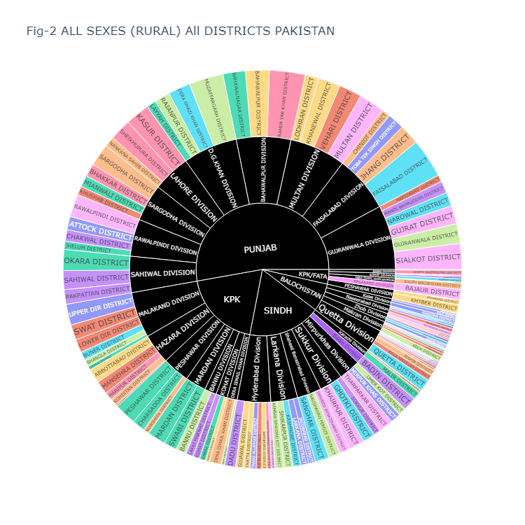
Fig-2 presents the population data for all sexes in rural areas across all districts of Pakistan. This code generates a sunburst chart using the dataset stored in the “df” dataframe. Here’s a breakdown of the arguments:
df: The data frame containing the dataset.path: The sequence of columns to define the hierarchical path in the sunburst chart. In this case, the hierarchy is defined by the ‘PROVINCE’, ‘DIVISION’, and ‘DISTRICT’ columns.values: The column containing the values that will be represented by the size of the arcs in the sunburst chart. In this case, it is the ‘ALL SEXES (RURAL)’ column.color: The column used to assign colors to the different segments in the sunburst chart. Here, the ‘DISTRICT’ column is used for this purpose.width and height: The dimensions of the sunburst chart in pixels.title: The title of the sunburst chart.color_discrete_map: A mapping of specific values in the ‘DISTRICT’ column to custom colors. Here, ‘(?)’ is mapped to black, ‘DIVISION’ to gold, and ‘DISTRICT’ to dark blue.Finally, fig.show() is used to display the sunburst chart.
fig = px.sunburst(df, path=['PROVINCE', 'DIVISION', 'DISTRICT'], values='ALL SEXES (RURAL)',
color='DISTRICT',
width=750, height=750,
title="Fig-2 ALL SEXES (RURAL) All DISTRICTS PAKISTAN",
color_discrete_map={'(?)':'black', 'DIVISION':'gold', 'DISTRICT':'darkblue'})
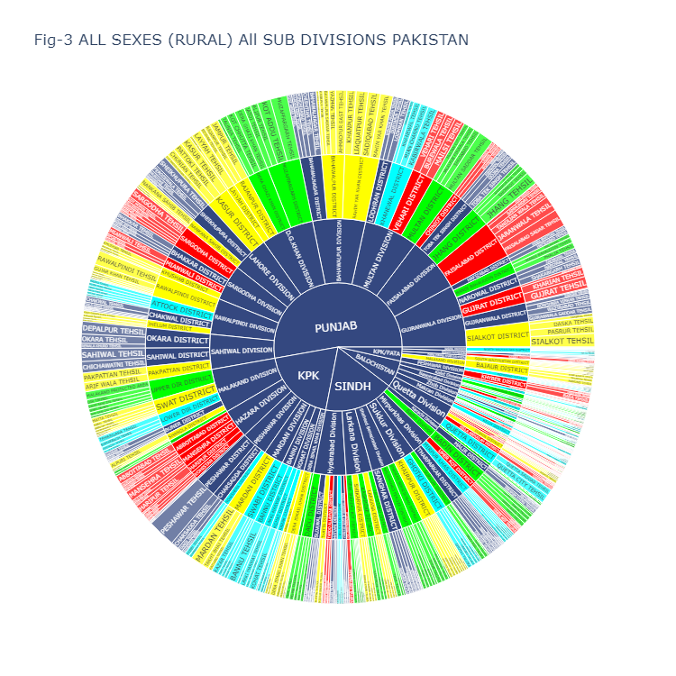
fig.show()Fig-3 displays the population data for all sexes in the rural areas of all sub-divisions (tehsils) in Pakistan. The accompanying code below includes a variable called “color_sequence” which consists of hex codes representing different colors. You have the flexibility to modify these hex codes to customize the color scheme of the sunburst plot. To select different hex codes, you can visit the website https://www.color-hex.com/ and choose colors according to your preference.
Here are the details of the arguments used:
color_sequence: A list of hex color codes that defines the desired color sequence for the segments in the sunburst chart.fig: The variable that holds the sunburst chart object.px.sunburst: The function used to create the sunburst chart.df: The data frame containing the dataset.path: The sequence of columns that define the hierarchical path in the sunburst chart. In this case, the hierarchy is defined by the ‘PROVINCE’, ‘DIVISION’, ‘DISTRICT’, and ‘SUB DIVISION’ columns.values: The column that provides the values for the size of the arcs in the sunburst chart. Here, it is the ‘ALL SEXES (RURAL)’ column.width and height: The dimensions of the sunburst chart in pixels.title: The title of the sunburst chart.color: The column used to assign colors to the different segments in the sunburst chart. Here, it is the ‘DISTRICT’ column.color_discrete_sequence: A parameter that accepts a list of hex color codes to define the color sequence for the segments in the sunburst chart.Finally, fig.show() is used to display the sunburst chart.
color_sequence = ['#FF0000', '#344880', '#00FF00', '#FFFF00', '#00FFFF']

fig = px.sunburst(df, path=['PROVINCE', 'DIVISION', 'DISTRICT', 'SUB DIVISION'],
                  values='ALL SEXES (RURAL)',
                  width=750, height=750,
                  title="Fig-3 ALL SEXES (RURAL) All SUB DIVISIONS PAKISTAN",
                  color='DISTRICT', color_discrete_sequence=color_sequence)
fig.show()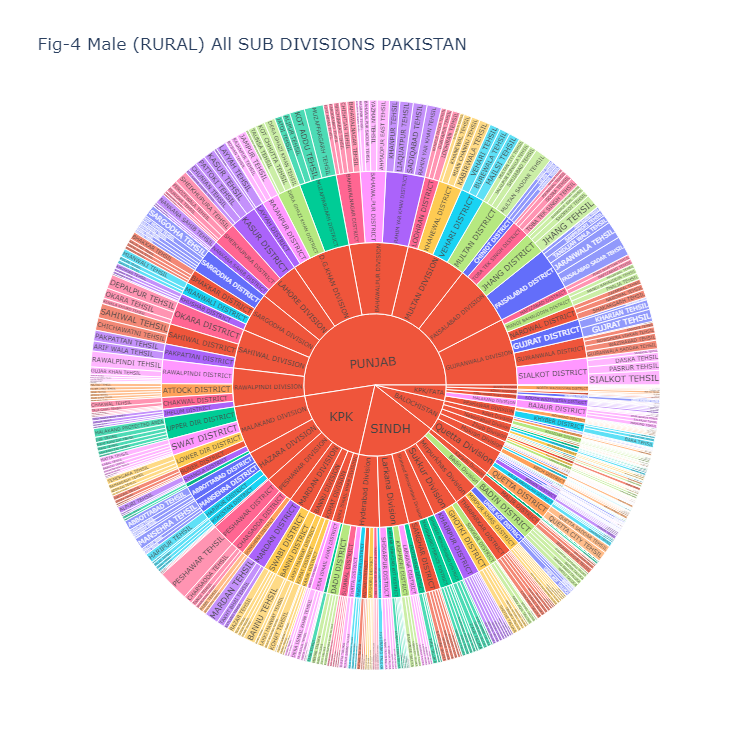
Fig-4 displays the population data for Males in the rural areas of all sub-divisions (tehsils) in Pakistan. The accompanying code is identical to Figure 3.
fig = px.sunburst(df, path=['PROVINCE', 'DIVISION', 'DISTRICT', 'SUB DIVISION'],
                  values='MALE (RURAL)',
                  color='DISTRICT',
                  width=750, height=750,
                  title="Fig-4 Male (RURAL) All SUB DIVISIONS PAKISTAN",)
fig.show()
Fig-5
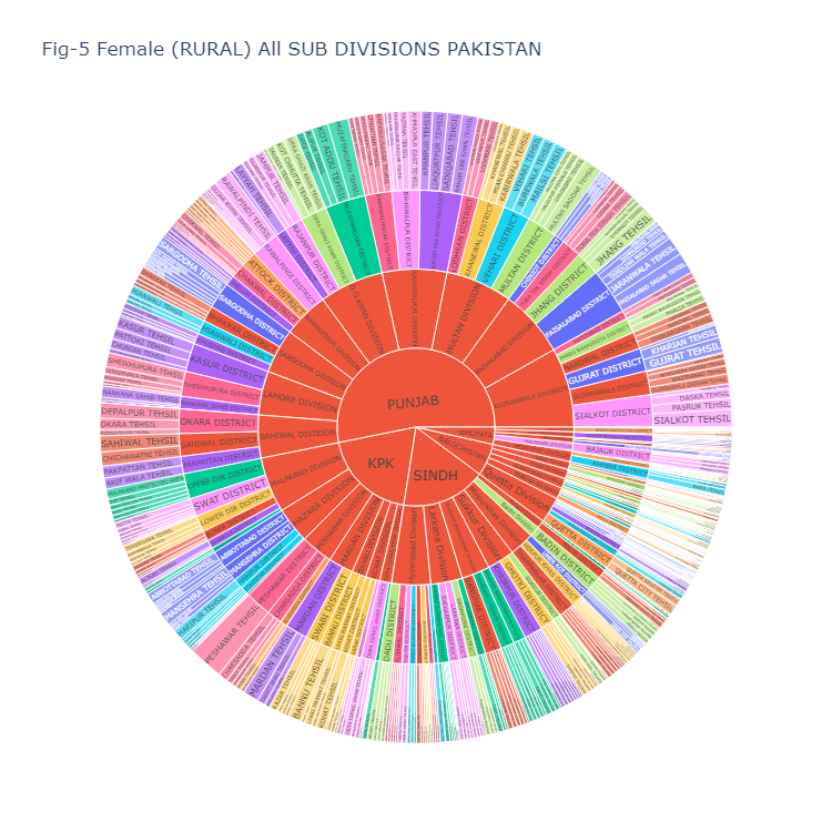
Fig-5 displays the population data for Females in the rural areas of all sub-divisions (tehsils) in Pakistan. The accompanying code is identical to Figure 3.
fig = px.sunburst(df, path=['PROVINCE', 'DIVISION', 'DISTRICT', 'SUB DIVISION'],
                  values='FEMALE (RURAL)',
                  color='DISTRICT',
                  width=750, height=750,
                  title="Fig-5 Female (RURAL) All SUB DIVISIONS PAKISTAN",)
fig.show()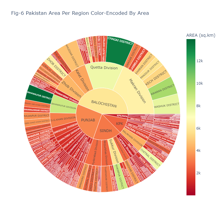
Fig-6 displays the Area in (in square kilometers) of all districts in Pakistan. Here’s a breakdown of the code:
This code creates a sunburst chart using the dataset stored in the “df” dataframe. Here are the details of the arguments used:
fig: The variable that holds the sunburst chart object.px.sunburst: The function used to create the sunburst chart.df: The data frame containing the dataset.path: The sequence of columns that define the hierarchical path in the sunburst chart. In this case, the hierarchy is defined by the ‘PROVINCE’, ‘DIVISION’, and ‘DISTRICT’ columns.values: The column that provides the values for the size of the arcs in the sunburst chart. Here, it is the ‘AREA (sq.km)’ column.width and height: The dimensions of the sunburst chart in pixels.color_continuous_scale: The color scale to be used for encoding the ‘AREA (sq.km)’ values. In this case, the “RdYlGn” color scale is used, which ranges from red to yellow to green.color: The column used to assign colors to the different segments in the sunburst chart. Here, it is the ‘AREA (sq.km)’ column.title: The title of the sunburst chart.Finally, fig.show() is used to display the sunburst chart.
fig = px.sunburst(df, path=['PROVINCE', 'DIVISION', 'DISTRICT'],
                  values='AREA (sq.km)',
                  width=750, height=750,
                  color_continuous_scale="RdYlGn",
                  color='AREA (sq.km)',
                  title="Fig-6 Pakistan Area Per Region Color-Encoded By Area")
fig.show()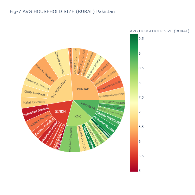
Fig-7 displays the average house hold size in the rural areas of all districts of Pakistan.
The code you provided generates a sunburst chart using the “px.sunburst” function from the Plotly Express library. Here’s a breakdown of the code:
This code creates a sunburst chart using the dataset stored in the “df” dataframe. Here are the details of the arguments used:
fig: The variable that holds the sunburst chart object.px.sunburst: The function used to create the sunburst chart.df: The data frame containing the dataset.path: The sequence of columns that define the hierarchical path in the sunburst chart. In this case, the hierarchy is defined by the ‘PROVINCE’, ‘DIVISION’, and ‘DISTRICT’ columns.values: The column that provides the values for the size of the arcs in the sunburst chart. Here, it is the ‘AREA (sq.km)’ column.width and height: The dimensions of the sunburst chart in pixels.color_continuous_scale: The color scale to be used for encoding the ‘AREA (sq.km)’ values. In this case, the “RdYlGn” color scale is used, which ranges from red to yellow to green.color: The column used to assign colors to the different segments in the sunburst chart. Here, it is the ‘AREA (sq.km)’ column.title: The title of the sunburst chart.Finally, fig.show() is used to display the sunburst chart.
fig = px.sunburst(df,
                  path=['PROVINCE', 'DIVISION', 'DISTRICT'],
                  values='AREA (sq.km)',
                  width=750,
                  height=750,
                  color_continuous_scale="RdYlGn",
                  color='AREA (sq.km)',
                  title="Fig-6 Pakistan Area Per Region Color-Encoded By Area")
fig.show()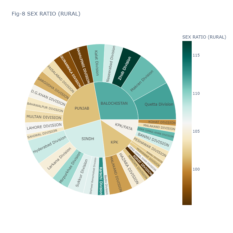
Fig-8 displays the Sex Ratio in the rural areas of all divisions of Pakistan.
The code you provided generates a sunburst chart using the “px.sunburst” function from the Plotly Express library. Here’s a breakdown of the code:
This code creates a sunburst chart using the dataset stored in the “df” dataframe. Here are the details of the arguments used:
fig: The variable that holds the sunburst chart object.px.sunburst: The function used to create the sunburst chart.df: The data frame containing the dataset.path: The sequence of columns that define the hierarchical path in the sunburst chart. In this case, the hierarchy is defined by the ‘PROVINCE’ and ‘DIVISION’ columns.values: The column that provides the values for the size of the arcs in the sunburst chart. Here, it is the ‘SEX RATIO (RURAL)’ column.color_continuous_scale: The color scale to be used for encoding the ‘SEX RATIO (RURAL)’ values. In this case, the “BrBG” color scale is used, which ranges from brown to green.color: The column used to assign colors to the different segments in the sunburst chart. Here, it is the ‘SEX RATIO (RURAL)’ column.title: The title of the sunburst chart.width and height: The dimensions of the sunburst chart in pixels.Finally, fig.show() is used to display the sunburst chart.
fig = px.sunburst(df,
                  path=["PROVINCE", "DIVISION"],
                  values='SEX RATIO (RURAL)',
                  color_continuous_scale="BrBG",
                  color='SEX RATIO (RURAL)',
                  title="Fig-8 SEX RATIO (RURAL)",
                  width=750, height=750)
fig.show()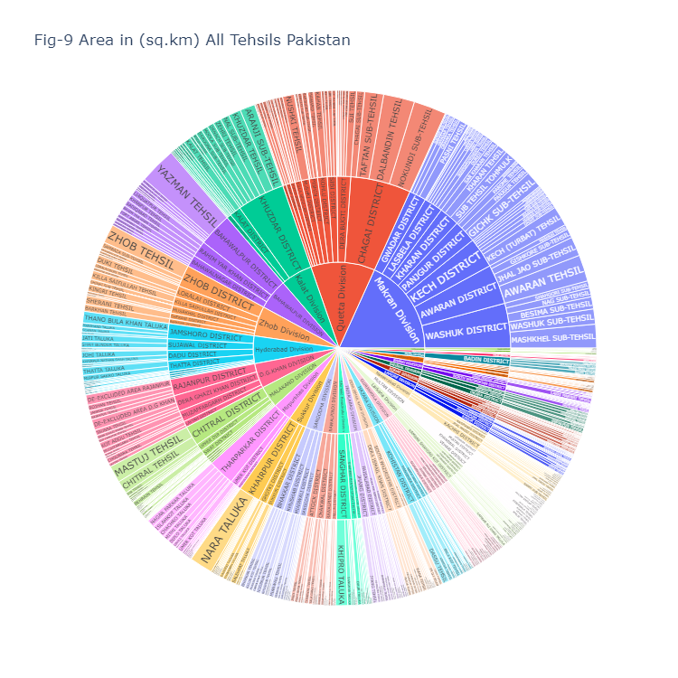
Fig-9 displays the Area in (in square kilometers) of all sub divisions (Tehsils) of Pakistan. This code creates a sunburst chart using the dataset stored in the “df” dataframe. Here are the details of the arguments used:
fig: The variable that holds the sunburst chart object.px.sunburst: The function used to create the sunburst chart.df: The data frame containing the dataset.path: The sequence of columns that define the hierarchical path in the sunburst chart. In this case, the hierarchy is defined by the ‘DIVISION’, ‘DISTRICT’, and ‘SUB DIVISION’ columns.values: The column that provides the values for the size of the arcs in the sunburst chart. Here, it is the ‘AREA (sq.km)’ column.title: The title of the sunburst chart.width and height: The dimensions of the sunburst chart in pixels.Finally, fig.show() is used to display the sunburst chart.
fig = px.sunburst(df,
                  path=["DIVISION", "DISTRICT", "SUB DIVISION"],
                  values='AREA (sq.km)',
                  title="Fig-9 Area in (sq.km) All Tehsils Pakistan",
                  width=750, height=750)
fig.show()
Plotly provides a wide range of color scales that you can use for your sunburst chart. You can change color_continuous_scale=”RdYlGn”, with color scales of your own choice. Here are a few examples of other color scales you can consider:
You can explore the complete list of available color scales in the Plotly documentation for more options and choose the one that best suits your visualization needs.